
Harmony in interior design is the sense of visual and emotional balance created when all the elements of a space—color, texture, furniture, lighting, and layout—work together smoothly. This article explains what harmony means in design, why it matters, the principles behind it, and practical ways to achieve it in any room, regardless of your style or budget.
Whether you’re redesigning a single room or planning a full home renovation, understanding harmony will help you avoid a space that feels chaotic, mismatched, or unfinished.
What Is Harmony in Interior Design?
Harmony in interior design refers to the pleasing arrangement of elements so that no single piece feels out of place or overwhelming. It’s the feeling you get when a room “just works,” even if you can’t immediately explain why.
Unlike matching, which means everything looks identical, harmony is about creating a sense of unity through repetition, balance, and thoughtful contrast. A harmonious room can include bold colors, varied textures, and eclectic furniture—as long as they relate to one another through a common thread.
Why Harmony Matters
A harmonious space affects more than aesthetics. It influences mood, comfort, and how functional a room feels day to day.
- Reduces visual clutter and mental fatigue
- Makes spaces feel more welcoming and comfortable
- Helps a room feel intentional rather than accidental
- Supports better flow between different areas of a home
Interior designers often treat harmony as a foundational principle, alongside balance, rhythm, and proportion, because it ties every other design decision together.
Core Principles Behind Harmony in Interior Design
Achieving harmony isn’t about following rigid rules—it’s about understanding a few key principles and applying them consistently.
1. Unity Through Repetition
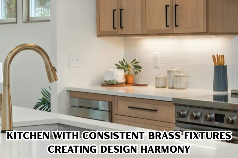
Repetition is one of the simplest ways to create harmony. Repeating a color, material, or shape throughout a space gives the eye a consistent pattern to follow.
For example, if you use brass fixtures in the kitchen, repeating brass accents in nearby light fittings or cabinet hardware ties the space together.
2. Balance of Visual Weight
Balance means distributing visual weight evenly across a room. This doesn’t mean symmetry—it means making sure no single area feels heavier or busier than the rest.
There are two common approaches:
- Symmetrical balance: Mirrored arrangements, ideal for formal or traditional spaces
- Asymmetrical balance: Varied elements that still feel evenly distributed, common in modern interiors
3. Proportion and Scale
Furniture and decor should be sized appropriately for the room. Oversized furniture in a small room—or tiny accessories in a large open space—breaks harmony immediately.
A simple rule: larger rooms can handle bolder, larger pieces, while smaller rooms benefit from lighter, more compact furniture.
4. Color Coordination
Color is often the fastest way to unify or disrupt a space. A harmonious color palette typically includes:
- A dominant base color (60% of the room)
- A secondary supporting color (30%)
- An accent color for contrast (10%)
This is sometimes called the 60-30-10 rule, widely used by designers to keep color schemes balanced without becoming monotonous.
5. Consistent Style or Theme
A room doesn’t need to follow one strict style, but it should have a recognizable thread—whether that’s minimalist, coastal, industrial, or transitional. Mixing styles without a connecting element (like color or material) often results in visual confusion rather than intentional eclecticism.
How to Achieve Harmony in Interior Design: Step-by-Step
Creating harmony doesn’t require an expert eye—it requires a clear process.
- Define a focal point. Choose one main feature, such as a fireplace, artwork, or statement furniture piece, and design around it.
- Choose a limited color palette. Stick to 3–5 colors maximum for most rooms.
- Select a unifying material or texture. Wood tones, metal finishes, or fabric types repeated across the room add cohesion.
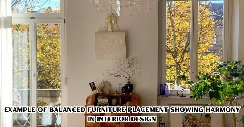
- Balance furniture placement. Distribute large and small items evenly instead of clustering everything on one side.
- Layer lighting intentionally. Combine ambient, task, and accent lighting rather than relying on a single overhead source.
- Edit, don’t add. Remove items that don’t support the room’s theme rather than adding more to compensate.
Practical Example
Imagine a living room with a navy sofa, wooden coffee table, and cream walls. To create harmony:
- Repeat navy in a throw pillow or artwork
- Match the wood tone of the coffee table to a side table or shelf
- Add one accent color, like mustard yellow, in small doses (a vase, a cushion)
- Keep lighting warm and consistent across lamps and overhead fixtures
This approach ties the room together without making it feel overly matched or sterile.
Common Mistakes That Break Harmony
Even well-intentioned design choices can disrupt harmony. Here are frequent mistakes to avoid.
- Too many focal points: Multiple competing statement pieces confuse the eye.
- Overloading colors: More than five main colors in one room often feels chaotic.
- Ignoring scale: Furniture that’s too large or small for the space disrupts balance.
- Mixing too many styles without a link: Eclectic doesn’t mean random—there needs to be a connecting element.
- Uneven lighting: Harsh, single-source lighting creates visual imbalance, even if furniture placement is perfect.
- Cluttered surfaces: Excess decor items reduce the sense of calm that harmony is meant to create.
Harmony vs. Other Harmony in Interior Design Principles
Harmony is often confused with related design concepts. Here’s how they differ.
| Principle | Focus | Example |
| Harmony | Overall unity and balance of all elements | Consistent color palette and materials throughout a room |
| Symmetry | Mirrored, identical arrangement | Matching lamps on either side of a bed |
| Contrast | Deliberate difference to create interest | Black frames on a white wall |
| Rhythm | Repeated patterns that guide the eye | A row of pendant lights above a kitchen island |
Understanding these differences helps you apply the right technique depending on the effect you want to achieve.
Tips for Maintaining Harmony in Interior Design as You Decorate Over Time
Homes evolve, and new furniture or decor is added gradually. To keep harmony intact:
- Photograph your room before shopping for new pieces, so you can visually check color and scale match
- Stick to your original color palette when introducing new items
- Avoid impulse purchases that don’t relate to existing materials or tones
- Periodically remove items that no longer fit the room’s theme
- Reuse existing textures (wood, metal, fabric) in new additions rather than introducing unrelated materials
Small Budget, Big Impact
Harmony doesn’t require expensive renovations. Small, affordable changes can significantly improve balance in a space:
- Repainting a single accent wall to match your palette
- Swapping mismatched hardware for a consistent finish
- Adding matching or coordinated textiles (cushions, curtains, Harmony in Interior Design, rugs)
- Rearranging existing furniture for better visual balance before buying anything new
Limitations to Keep in Mind
While harmony improves most spaces, it’s worth noting a few limitations:
- Overemphasis on harmony can make a room feel flat or lacking personality if taken too far
- Personal style and functional needs should always take priority over strict design rules
- What feels harmonious is partly subjective and can vary by culture, personal taste, and lighting conditions in the actual space
Good design balances harmony with individuality, rather than treating it as an absolute rule.
If you’re still working on your color choices, check out our detailed guide on the 60-30-10 color rule to build a balanced palette from scratch. You may also find our article on small space design tips useful if you’re decorating a compact room.
For a deeper look, read our comparison guide on symmetry vs. asymmetry in interior design, or explore our guide on mixing design styles if you want to blend different aesthetics.
Design principles like harmony and balance are widely taught in professional design education, and organizations such as the American Society of Interior Designers offer resources for those looking to study these concepts further.
Frequently Asked Questions
What does harmony mean in interior design?
Harmony means all elements in a room—color, texture, Harmony in Interior Design furniture, and lighting—work together to create a unified, balanced look. It doesn’t mean everything matches exactly, but rather that pieces relate to each other through repeated colors, materials, or themes, creating a cohesive overall feel.
How do you create harmony in a small room?
Use a limited color palette, choose appropriately scaled furniture, and repeat one or two materials throughout the space. Avoid clutter, since small rooms show imbalance more easily. Light, Harmony in Interior Design neutral tones combined with a single accent color often work well for creating harmony in compact spaces.
Is harmony the same as symmetry in design?
No. Symmetry involves mirrored, identical elements, while harmony is broader—it’s about overall balance and unity, which can include asymmetrical arrangements. A room can be harmonious without being symmetrical, as long as visual weight and color are distributed evenly throughout.
What is the 60-30-10 rule in interior design?
The 60-30-10 rule is a color guideline where 60% of a room uses a dominant color, Harmony in Interior Design 30% a secondary color, and 10% an accent color. This ratio helps create harmony by preventing any single color from overwhelming the space while still allowing visual interest.
Can you mix design styles and still achieve harmony?
Yes, as long as there’s a connecting element like color, material, or texture linking the different styles together. This approach, often called eclectic design, works best when it’s intentional rather than random, ensuring the mixed elements still feel like part of one cohesive space.
Conclusion
Harmony in interior design is what transforms a collection of furniture and decor into a space that feels complete, comfortable, and intentional. By focusing on core principles like repetition, balance, proportion, and color coordination, Harmony in Interior Designyou can create rooms that feel unified without becoming boring or overly matched.
Start small: pick one room, define a focal point, limit your color palette, and gradually adjust furniture and decor to align with that vision. Over time, these consistent choices will naturally build a harmonious home you enjoy spending time in.