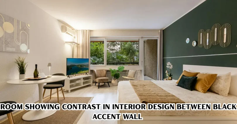

Contrast in interior design is the technique of pairing opposite elements—colors, textures, shapes, or materials—to create visual interest and depth within a space. This article explains what contrast means in design, why it matters, and how you can use it effectively in your own home, whether you’re decorating a single room or planning a full renovation.
Many homeowners assume a beautiful room needs matching furniture and coordinated colors. In reality, spaces that feel flat or boring are often missing one key ingredient: contrast. When used correctly, contrast draws the eye, highlights focal points, and gives a room personality without making it feel chaotic.
What Is Contrast in Interior Design?
Contrast in interior design refers to placing two different or opposing elements next to each other to make each one stand out more clearly. This could mean light against dark, rough against smooth, old against new, or curved against angular.
Designers use contrast intentionally. It’s not about randomly mixing styles—it’s about creating a visual conversation between elements so the space feels layered and intentional rather than accidental.
Why Contrast Matters in Home Design
Contrast matters because it prevents a room from looking flat, monotonous, or forgettable. Without contrast, even expensive furniture and finishes can blend together and lose their impact.
Here’s what good contrast does for a space:
- Creates a focal point that naturally draws the eye
- Adds depth and dimension to flat surfaces
- Makes small spaces feel more dynamic
- Balances busy patterns with calm, simple elements
- Reflects personality and intentional design choices
A room without any contrast can feel safe, but safe often means unmemorable. Contrast is what turns a “nice” room into a “wow” room.
Types of Contrast Used in Interior Design
There are several ways to introduce contrast into a home. Understanding each type helps you apply the right one for your space and goals.
Color Contrast
Color contrast is the most common and easiest way to create visual interest. This involves pairing colors that sit opposite each other in tone or intensity, such as black and white, navy and cream, or deep green and soft beige.
A popular approach is the 60-30-10 rule: 60% of the room in a dominant color, 30% in a secondary color, and 10% in an accent color that provides contrast. This keeps the color scheme balanced instead of overwhelming.
Simple examples include:
- A black accent wall in an otherwise white room
- Dark wood furniture against a light-colored floor
- A bold-colored sofa in a neutral living room
Texture Contrast
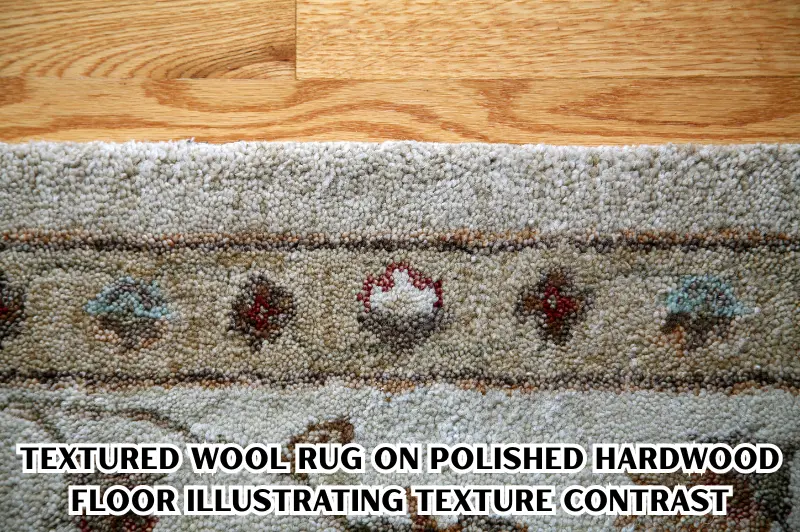
Texture contrast is achieved by combining materials that feel or look different from one another. Think smooth glass next to rough stone, or soft velvet cushions on a hard leather sofa.
This type of contrast is especially useful in neutral or monochromatic rooms, where color contrast isn’t the main strategy. Layering textures keeps the space feeling rich instead of flat, even when the color palette is limited.
Examples of texture pairing:
- A wool rug on a polished hardwood floor
- Linen curtains against a concrete wall
- A metal light fixture above a wooden dining table
Shape and Form Contrast
Shape contrast plays with geometry—combining curves with straight lines, or organic forms with rigid, structured ones. A round coffee table in a room full of rectangular furniture is a classic example.
This type of contrast is subtle but powerful. It softens spaces that feel too rigid or adds structure to rooms that feel too soft and shapeless.
Light and Dark Contrast
Light and dark contrast, also called tonal contrast, is about the interplay between bright and shaded areas or light and dark finishes. This is one of the most effective tools for creating drama and depth in a room.
Examples include:
- Dark cabinetry paired with light countertops in a kitchen
- A well-lit reading nook against a dimly lit hallway
- White walls with black window frames
Style Contrast
Style contrast mixes different design eras or aesthetics within one space, such as a modern sofa with an antique side table, or industrial lighting in a traditionally styled room. This approach works well for people who want an eclectic, collected-over-time look rather than a single showroom style.
How to Use Contrast Without Overdoing It
Contrast is powerful, but too much of it can make a room feel busy or disjointed. The goal is balance, not competition between elements.
Start With One Type of Contrast
If you’re new to designing with contrast, begin with just one type—usually color or texture—before layering in others. This keeps the room cohesive while you experiment.
Use a Neutral Base
A neutral base, such as white, beige, or gray walls, gives contrasting elements room to stand out. If everything in the room is bold, nothing actually looks contrasted anymore.
Repeat Contrasting Elements at Least Twice
A single dark object in an all-white room can look like a mistake rather than a design choice. Repeating a contrasting color or texture two or three times around the room helps it read as intentional.
Follow the Rule of Odd Numbers
Grouping contrasting accents in odd numbers—such as three black frames or three textured cushions—tends to look more natural and visually pleasing than even groupings.
Common Mistakes to Avoid With Contrast
Even well-intentioned attempts at contrast can go wrong. Here are mistakes worth avoiding:
- Using too many contrasting elements at once – This overwhelms the eye and makes the room feel cluttered.
- Ignoring proportion – A tiny contrasting accent in a large room can get lost, while an oversized one can dominate unfairly.
- Mismatching undertones – Combining warm and cool tones without a plan can make colors clash rather than complement.
- Skipping a neutral anchor – Without a calm base, contrasting elements compete instead of collaborating.
- Forgetting the room’s function – A high-contrast, high-energy scheme might not suit a bedroom meant for rest.
Contrast in Different Rooms of the Home
Contrast works differently depending on the room’s purpose and how it’s used daily.
Living Room
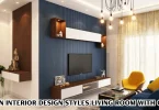
In living rooms, contrast often comes through furniture and accent pieces—a dark sofa against light walls, or patterned cushions on a solid-colored couch. Since living rooms are social spaces, slightly bolder contrast is usually welcome here.
Kitchen
Kitchens commonly use contrast between cabinetry and countertops, such as dark lower cabinets with light upper cabinets, or a black kitchen island in a white kitchen. This creates a clear visual anchor in a functional space.
Bedroom
Bedrooms benefit from softer contrast since the goal is relaxation. Muted tonal contrast, like charcoal bedding against light gray walls, adds interest without disrupting a calm atmosphere.
Bathroom
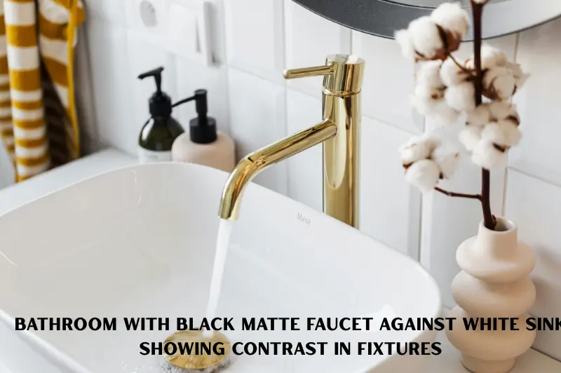
In bathrooms, contrast often appears through tile choices, such as dark grout on light tiles or a black matte faucet against a white sink. These small details add character to otherwise simple, utilitarian spaces.
Contrast vs. Harmony: Finding the Right Balance
| Aspect | Contrast | Harmony |
| Purpose | Creates visual interest and focal points | Creates a calm, unified feel |
| Best used for | Accent walls, statement furniture, focal points | Overall color scheme, background elements |
| Risk if overused | Room feels chaotic or busy | Room feels flat or boring |
| Common technique | Pairing opposites (light/dark, rough/smooth) | Using similar tones and textures throughout |
| Ideal ratio | Used in smaller doses (10-20% of a room) | Forms the majority of the design (80-90%) |
The most successful interiors don’t choose one over the other—they use harmony as the foundation and contrast as the highlight. Think of harmony as the quiet background music and contrast as the melody that stands out.
Practical Tips to Add Contrast on a Budget
You don’t need a full renovation to introduce meaningful contrast into your home.
- Swap out cushion covers or throws in a contrasting color or texture
- Paint a single accent wall instead of repainting the whole room
- Add a patterned rug to break up solid flooring
- Introduce black or dark metal fixtures into a light-colored room
- Mix in one or two vintage or unique pieces among modern furniture
- Use contrasting picture frames or artwork to draw the eye
These small, affordable changes can transform a flat-feeling room into one with genuine visual depth.
If you’re just starting out, it also helps to understand how to choose the right color palette before applying contrast techniques.
Pairing this with the 60-30-10 color rule makes it even easier to keep your space balanced.
For more ideas, check out our guide on small living room design ideas that also apply subtle contrast techniques.
Pairing this with the warm vs. cool tones guide can help you avoid clashing colors while adding contrast.
Resources like Canva’s Color Wheel guide explain how complementary and opposite colors work together.
Organizations such as the American Society of Interior Designers (ASID) offer helpful resources for homeowners exploring design fundamentals.
Frequently Asked Questions
What is an example of contrast in interior design?
A common example is pairing a black accent wall with white furniture, or placing a smooth glass table next to a rough woven rug. Dark kitchen cabinets against light countertops also demonstrate contrast clearly, Contrast in Interior Design, combining color and texture differences Contrast in Interior Design, within one cohesive space.
Is too much contrast bad for a room?
Yes, excessive contrast can make a room feel chaotic, cluttered, or visually exhausting. The best approach uses contrast selectively, often through accents or focal points, Contrast in Interior Design, while keeping the majority of the space rooted in a calm, neutral, or harmonious palette for balance.
How do I add contrast without repainting my whole house?
You can add contrast through smaller changes like accent walls, patterned cushions, contrasting rugs, dark metal fixtures, or a few statement furniture pieces. These low-cost updates Contrast in Interior Design, introduce visual interest without requiring a full-scale renovation or major financial investment.
Does contrast work in small rooms?
Yes, contrast can actually make small rooms feel more dynamic and intentional rather than cramped. Using contrast sparingly, such as one accent color or textured item, helps define the space without overwhelming it, Contrast in Interior Design, Contrast in Interior Designunlike using multiple bold contrasts at once.
What’s the difference between contrast and clashing colors?
Contrast is intentional and balanced, Contrast in Interior Design, using complementary opposites like light and dark tones thoughtfully placed. Clashing happens when colors or elements compete without a clear plan or connection, Contrast in Interior Design, Contrast in Interior Design, creating visual confusion rather than the deliberate, eye-catching effect that good contrast achieves.
Conclusion
Contrast in interior design is one of the simplest yet most effective tools for making a home feel intentional, layered, and visually engaging. Whether it’s through color, texture, shape, or lighting, contrast helps highlight what matters most in a room while preventing spaces from feeling flat or forgettable.
The key is balance: use a neutral, harmonious base and let contrast do the work of drawing attention to focal points. Start small—one accent wall, one textured cushion, one bold fixture—and build from there. Once you see how a single contrasting element can transform a space, you’ll want to apply the same thinking throughout your entire home.